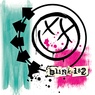
In order to promote their new album, Blink-182 introduced a fresh logo featuring a smiley face with Xs for eyes and five arrows on its left side. Barker, a member of the band, explained that the Blink-182 logo was inspired by his clothing line, Famous Stars and Straps.
He aimed to create an iconic symbol for the band, drawing inspiration from his favourite group, The Jam, who often incorporated arrows in their designs. The result was a pop-art influenced emblem.
Hoppus, another member of the band, credited Barker with spearheading the artwork for the album, including the smiley-face stickers and posters that appeared all over Los Angeles.
Barker enlisted the help of his tattoo artist, Mister Cartoon, for the album’s artwork, and his close friend Estevan Oriol for photography. Barker later noted that their styles added an edgy element to Blink’s image without making them seem too gangster.
MusicOMH characterized the album booklet as a carefully crafted work that resembled a Warholian pastiche.
Each song in the booklet features notes about the lyrics’ inspiration, the significance to the band members, and the recording techniques employed. Initially, the band wanted the CD booklet to be made from canvas material, but Geffen offered them a choice between custom artwork or a lower retail price of US$12.
Ultimately, Blink-182 decided on the latter option, as they believed it was more important for younger listeners to access the album at a lower cost.


